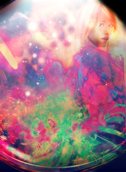
I dont expect people to be digging these as much but they are more my own experimentation.
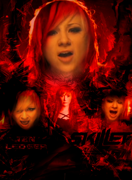
Here's a piggyback to the first graphic.
Thought I'd share anyway.. Just playing with the fact that people say things are over saturated.
I think it makes some really interesting pieces.


Siiiiick stuff here.
But, did you spell Daft Punk incorrectly on purpose? or accidently?
Thanks, yeah.. I called the piece Daft Funk haha
Last edited by Antwan; 08-30-2012 at 12:05 PM.
Well, I'm getting pretty comfortable creating my pieces..
If something is over saturated or lacking contrast
it is usually intentional or I just liked how it came out Personally.

Can't sleep.. Made something.

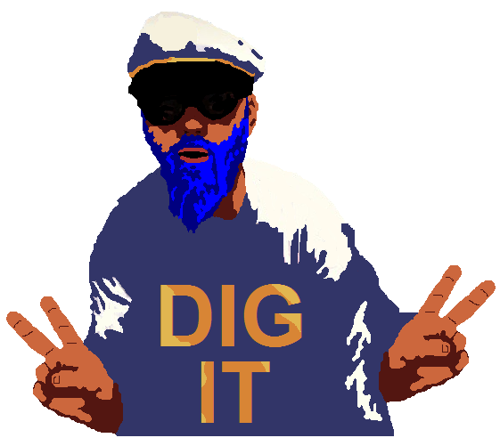
So my dad is a classic 90's rock hippie..
Someone said they wanted him on a t-shirt so I did my first vector the other day.
They liked it so much that I'll actually be helping with the design for a SOBAR logo as well, so that's cool.
http://www.blueshovel.org/sobar/ Shameless Plug!
Still keeping up with all my hobbies, recent graphics:
Last edited by Antwan; 12-08-2015 at 10:57 AM.
 Posting Permissions


 Reply With Quote