Just wondering if anyone would take a crack at one of these. I've tried and failed terribly, so looking for someone who'd like to give it a shot. Thanks.
Brockjangles Deck
Brock Pigpen Deck
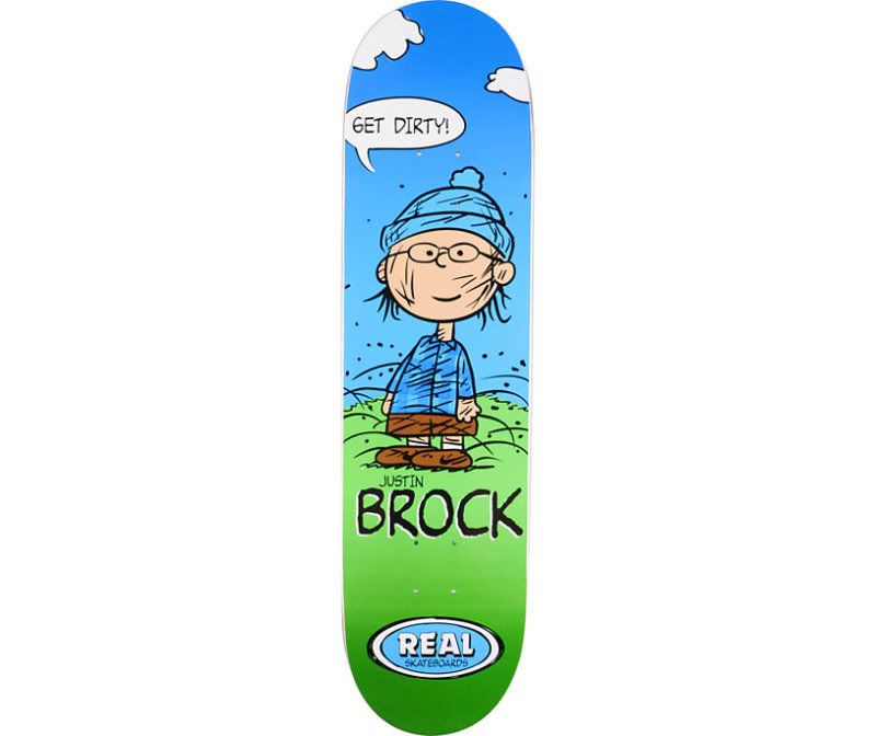
Just wondering if anyone would take a crack at one of these. I've tried and failed terribly, so looking for someone who'd like to give it a shot. Thanks.
Brockjangles Deck
Brock Pigpen Deck

Bear "replicant" Powell
"I am Shaolin-Style!"
XBL: replicant#2618
Currently Playing: Diablo 2 Resurrected, Elden Ring, Skate 3
I'm all over the pigpen deck..
Sounds like a plan. I am looking forward to seeing it.
Bear "replicant" Powell
"I am Shaolin-Style!"
XBL: replicant#2618
Currently Playing: Diablo 2 Resurrected, Elden Ring, Skate 3
i am doing it right now but i got no real assets
yh man im new to this graphic stuff aswell but i tryed to make it and here it is btw it looks better in game
http://skate.ea.com/gallery?contentT...ntType=GRAPHIC
i think drawls made the pigpen deck didnt he deacon ?
Drawls did a version of it, but it's proportions are off and has extra stuff added to it.
Not a bad version of the Brockjangles deck there KROX, but you spelled "Biscuits" wrong. >_<!
Bear "replicant" Powell
"I am Shaolin-Style!"
XBL: replicant#2618
Currently Playing: Diablo 2 Resurrected, Elden Ring, Skate 3
I'm almost done with the pigpen deck the flannel on the shirt is being a pain. the other one should be staright forward tbh if the "real" logo is on the GC. Only real work will be doing the brockjangles lettering/
ive got some real logo in black and white tell me if u want em there on my board
Hows this? Its not exact as i just couldn't get the font correct for the name no matter how many times i tried. I even tried using chaos crystal (which for me is a sin as i don't use it!) but it just didn't work, howver in game i don't think you will notice it. I've darkened the image as colour come out a bit funky ingame, however let me know if you need me to amend anything as I have it saved. I can also change the name so it says yout GT if you want?
DL Link: http://skate.ea.com/gallery?contentT...2f93f495a6571e
holy fucking piss shit.

Great fucking job, Deacon! I´ll be rocking that one fo sho yo!
I will definitely know when I get a chance to play with it shortly, but just looking at it I have to say it looks amazing. Awesome work man.
Edit: It looks good in game. A touch washed out, but with the light colors and even 50% opacity overlay that is to be expected. The only things that are slightly off in game is the REAL logo and "Get Dirty!" come off hard to make out. I am guessing it's the mild stretch to fit the deck causing it, but the graphic looks tight. This will work quite well for me and no need for my name on it. I don't mind representing Brock since he's another North Carolina guy. Thanks for the hard work.
Last edited by replicant; 04-27-2011 at 02:41 AM.
Bear "replicant" Powell
"I am Shaolin-Style!"
XBL: replicant#2618
Currently Playing: Diablo 2 Resurrected, Elden Ring, Skate 3
Nw man. I actually tested it this morning I his name is hidden behind the trucks.
I've done a quick re edit, enhanced the colours, mae the image in the center smaller to fit between the truck and made the real logo and get dirty bigger. I can't test it at the moment as I am work but if someone can feedback I can re adjust it.
http://skate.ea.com/gallery?contentT...2f967c42d35ae8
Sweet, that looks a lot better IMO.
I'll have a go at the BrockJangles one soon. I got a couple of other to finish before I start on that one.
Yo,
Brockjangles deck is almost finished. Been on a mad park build last couple of days. I'll try and get it done tonight and upload it.
replicant, your character looks like justin brock so much haha.
great job Deacon. can't wait to see brockjangles. hopefully psn gets up and running soon so i can use that!
Sounds awesome man. I can't wait to see it and give it some play time.
I blame Real Since Day One. I've been a fan of him for a bit now and I gotta support NC skaters always. His part was so beasty I had to turn from a Militant Black Skater into a Brock Wannabe. Too bad I can't skate with a cig and a beer in game.
Last edited by replicant; 05-04-2011 at 05:02 AM.
Bear "replicant" Powell
"I am Shaolin-Style!"
XBL: replicant#2618
Currently Playing: Diablo 2 Resurrected, Elden Ring, Skate 3
Ok i'm not 100% happy with the lettering but this is probably the best I can get it. I've not tested it ingame, let me know of the colour comes out ok.
DL Link: http://skate.ea.com/gallery?contentT...2fcdb12269424f
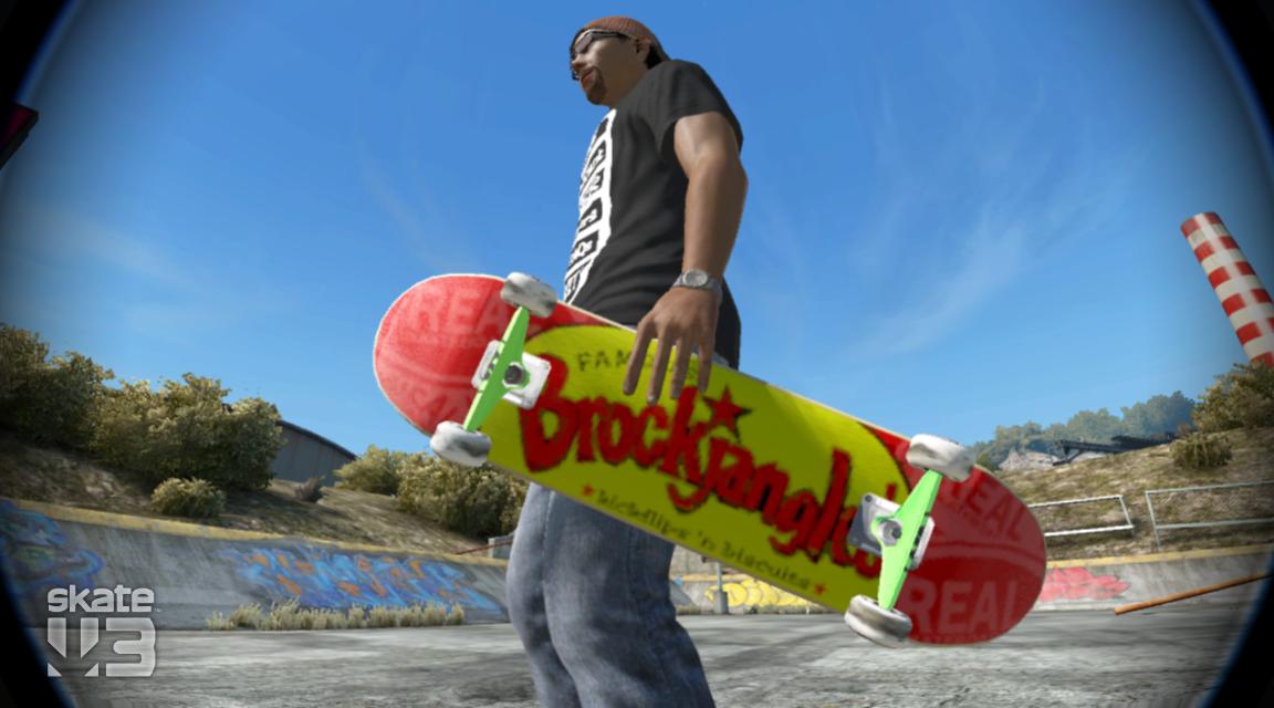
Heya man, pretty nice job. That text is awkward as hell to do I bet. The small text lettering shows up light in-game mainly because the text is so fine when stretched to fit. The red coloration in Brockjangles' itself looks a bit off as if different colors of red were used. However, it looks pretty solid to me in the game overall. Here are a couple pics to show it in-game. Thanks for the new deck.
In the Shade:
In the Light:
Bear "replicant" Powell
"I am Shaolin-Style!"
XBL: replicant#2618
Currently Playing: Diablo 2 Resurrected, Elden Ring, Skate 3
I've made a couple of amendments
DL LINK: http://skate.ea.com/gallery?contentT...2fcf09fc70055b
Just downloaded V2 and here is a pic of it. Must be missing something as it seems the same to me.

Bear "replicant" Powell
"I am Shaolin-Style!"
XBL: replicant#2618
Currently Playing: Diablo 2 Resurrected, Elden Ring, Skate 3
I added a slight yellow spot to the N and centered the yellow sticker a bit more and also shaded the yellow area to make the writing stand out a tiny bit better.
I've actually deleted the v.2 i posted above:
new links here:
DL Link: http://skate.ea.com/gallery?contentT...2fcf2544cb4337
try adding a 50% black layer on top usually fixes the colours ingame
adda, it's not an issue with color balance in the game.
The things that stand out are "Famous" and "kickflips 'n biscuits" which are very faint in the game.
The adjustment in yellow opacity didn't pop the black text because they lack boldness. The v1 yellow actually popped fine in the game.
The red on Brockjangles has this weird multi-layered look since the lettering was custom so up close you see all the puzzle pieces.
At a moderate distance Brockjangles looks fine, but even up close the black words at top and bottom are barely readable in shade or light.
I wish I could show a high res pic to get across what I mean and not sound like an ungrateful ass as it appears I am coming across in this disription.
Summary: Thicker/Bolder lettering on "Famous" and "kickflips 'n biscuits" would make this I think as best as it can get. If that is not possible, then it is still a sick as fuck deck that I will rock with my pig pen as well.
Bear "replicant" Powell
"I am Shaolin-Style!"
XBL: replicant#2618
Currently Playing: Diablo 2 Resurrected, Elden Ring, Skate 3
I'll try layering text tongiht when i get in, I think myabe 2 or 3 on top should make it stand out. Its funny when I started making he pig pen i thought this is gonna take some time and i'll be able to knock out the brockjangles one in like 30 mins, oh how wrong was i! lol. its cool man, I like to get things as perfect as I can the feedback is appreciated so I can refine etc.
In realtion to the text i've still not fond a way to get it exact, in the GC is looks fine with a reasonable black edging, but in game the stretch to make it fit really ruins images. I wish EA had Graphic templates, like T-shirt, board, Hat etc that way you don't have to stretch everything allthe time. If you could just layer the board striaght on all the graphics would look so much better.
Fuck EA and Black Box! lol
Bear "replicant" Powell
"I am Shaolin-Style!"
XBL: replicant#2618
Currently Playing: Diablo 2 Resurrected, Elden Ring, Skate 3
Paint would be amazing as I have a Pen/tablet combo on my Pc at home and work. I don't htink I would want to be able to import pictures as it would be too easy but a proper free hand grpahics creator would amazing. I could finally do the graff for the walls on my southbank remake.
I'm still debating about downloaidng Chaos Crystal, but i'm in two minds as I like the challange without it.
ok one more go.
DL Link: http://skate.ea.com/gallery?contentT...2fd1cb4a831cfb
I've made the text bolder and also centered the image/sticker slightly.
Last edited by Deacon; 05-08-2011 at 03:53 PM.
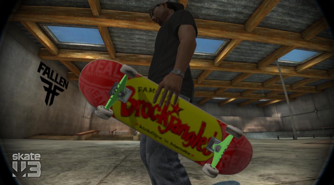
Version 3 hit the nail on the head. Very sexy in game and I appreciate all the hard work.
Here is a pic of it in game now in the shade. I wish the pic was better, but when you do a pic using EA I can tell at least 6 different resolutions used within the picture. >_<!
Bear "replicant" Powell
"I am Shaolin-Style!"
XBL: replicant#2618
Currently Playing: Diablo 2 Resurrected, Elden Ring, Skate 3
Sick. I was rocking that ingame yesterday. not bad if i do say so msyelf! :-)