


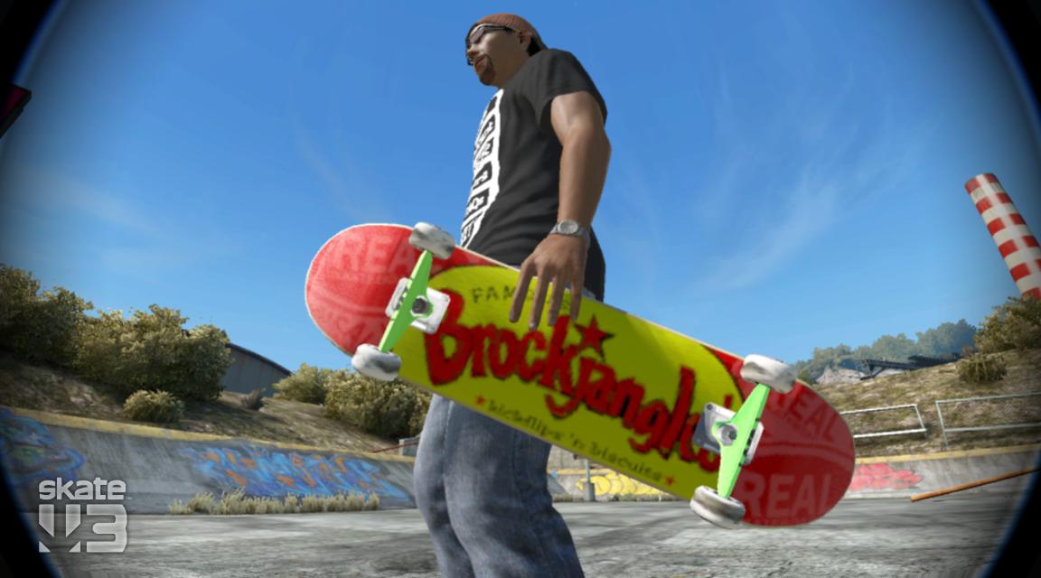
Heya man, pretty nice job. That text is awkward as hell to do I bet. The small text lettering shows up light in-game mainly because the text is so fine when stretched to fit. The red coloration in Brockjangles' itself looks a bit off as if different colors of red were used. However, it looks pretty solid to me in the game overall. Here are a couple pics to show it in-game. Thanks for the new deck.
In the Shade:
In the Light:


 Reply With Quote